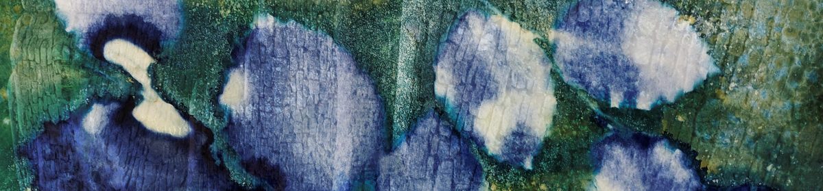
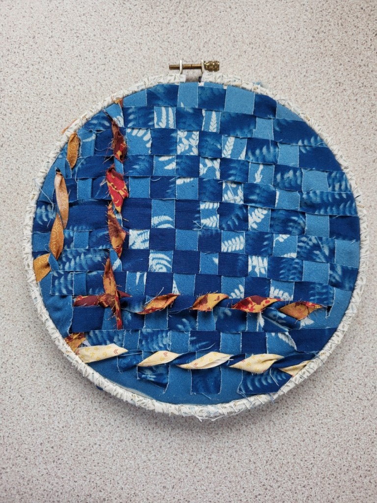
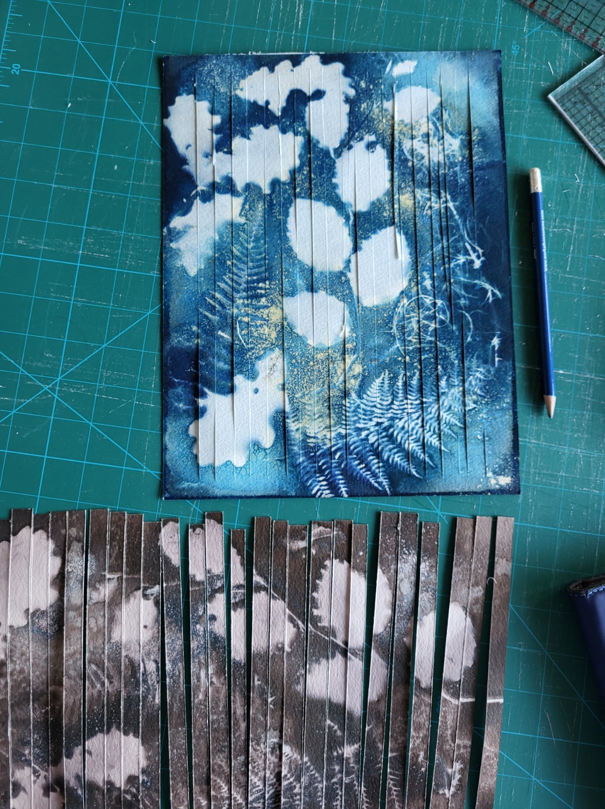
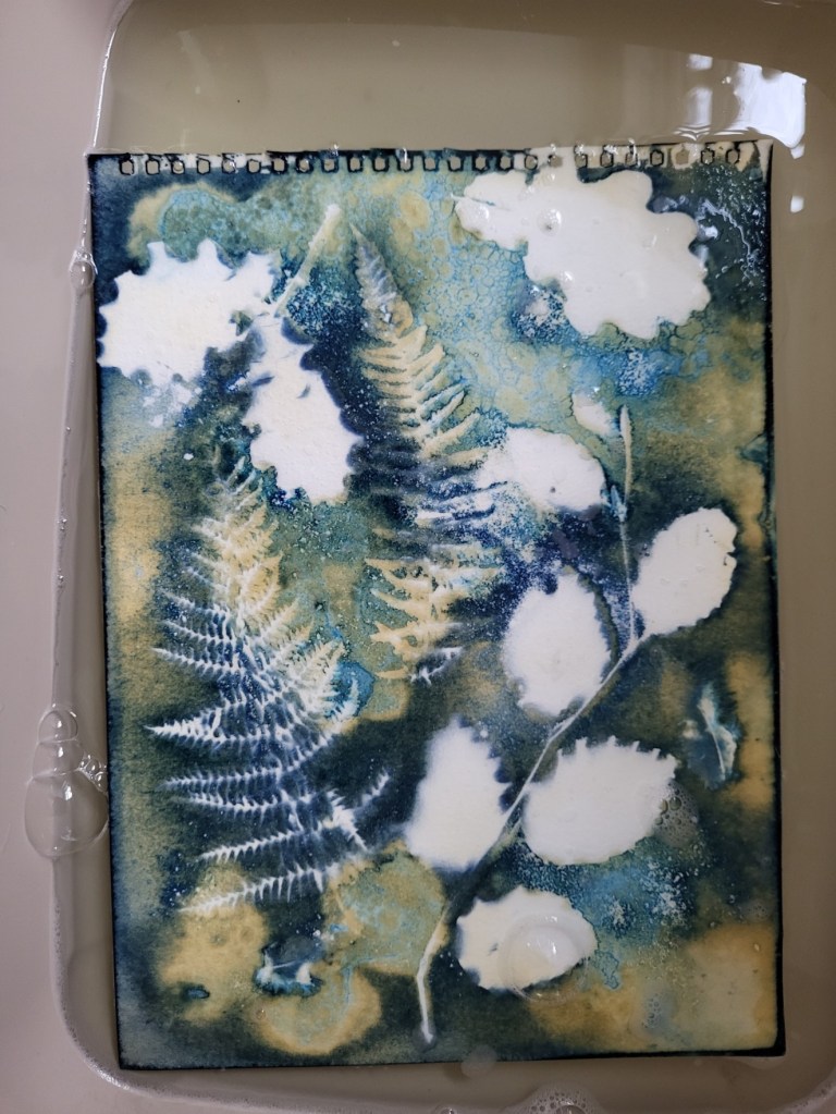
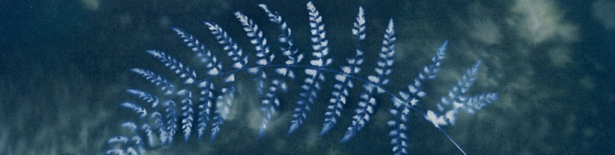
Artquest 30/30 day 3 and the hint is ‘reuse. recycle’ reclaim’ which was very apt for my focus for this challenge which is, as far as possible to utilise existing material that has lain untouched for months. Having started the challenge bleaching and toning, then weaving old cyanotype prints, today’s plan was to weave 2 failed cyanotypes printed onto fabric, one under and the other over exposed. When making cyanotypes on fabric, it needs to be stretched tight to get an even print and one had been made on a 9″ embroidery hoop resulting in the print being circular, so I used this again as it kept the fabric taught as I wove the 2 together. In both cases, the prints had been made using ferns, so, like those used on day 2, they were similar but different. I think the subject matter is more obvious there than it was in yesterday’s piece. To add a little texture I went back to my textile scrap box and ‘reclaimed’ a few contrasting strips. Does this add interest or just confusion? Outside of my comfort zone certainly but I think I like it.
For day 4, I will be going back to bleaching and toning.
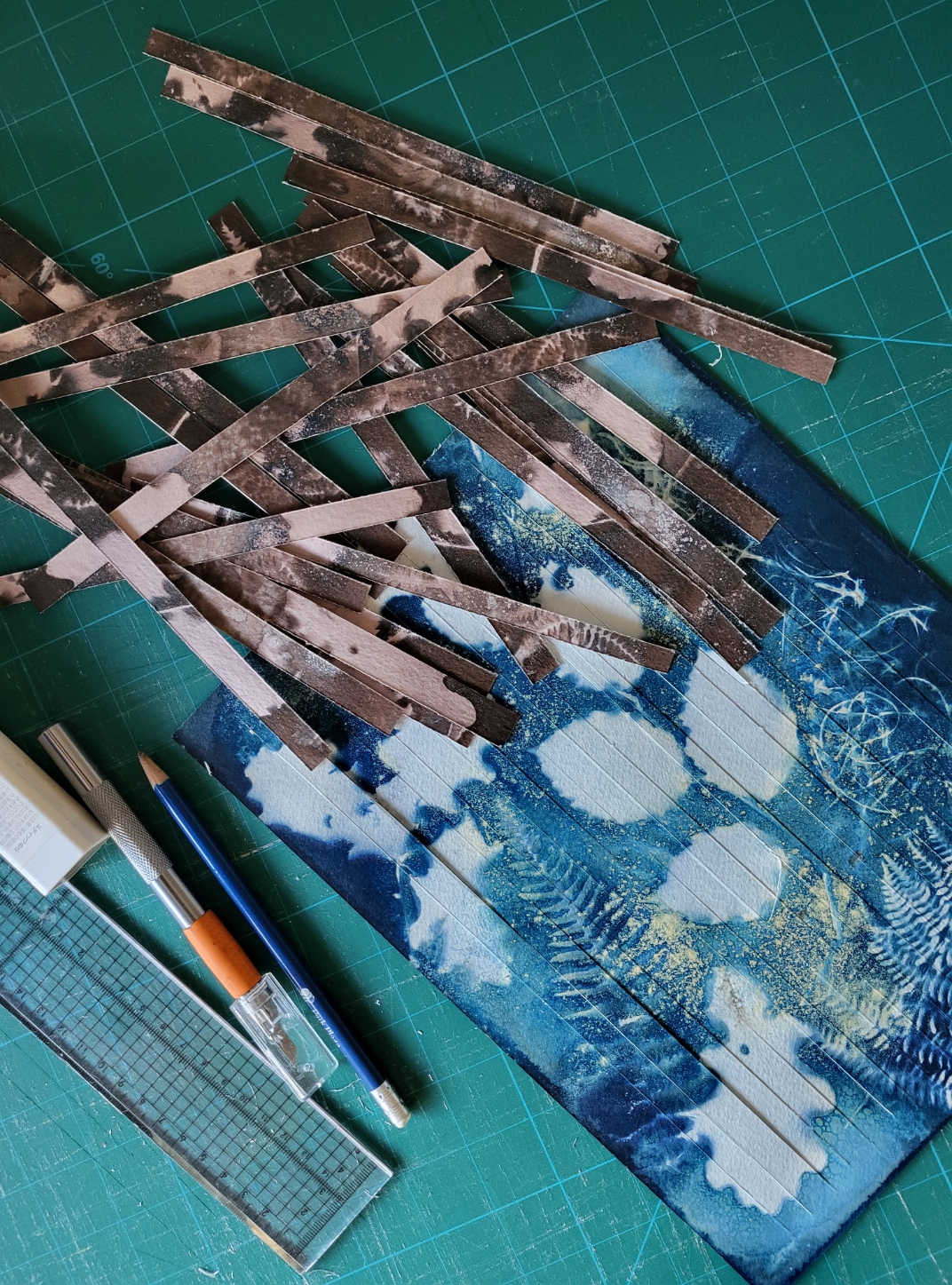
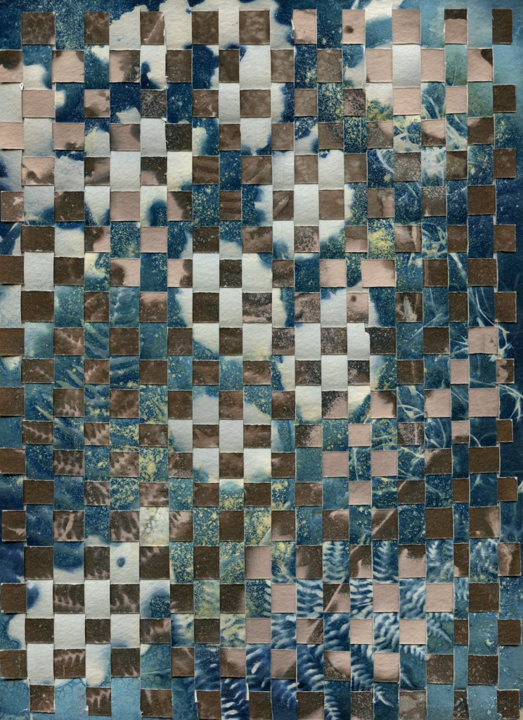
My first thought when I saw my toned print this morning was ‘Oh dear’, it was quite a lot darker than I had though last night but it is all part of the learning process. I had planned to weave my prints from yesterday and that is what I would do. I have very little experience of weaving photographs so did a little research. One short video I came across, link below, suggested I cut one photograph in vertical strips but keeping the frame intact and the other into horizontal strips. Preparation usually pays off and I felt this would help keep the piece together as I worked so followed this process.
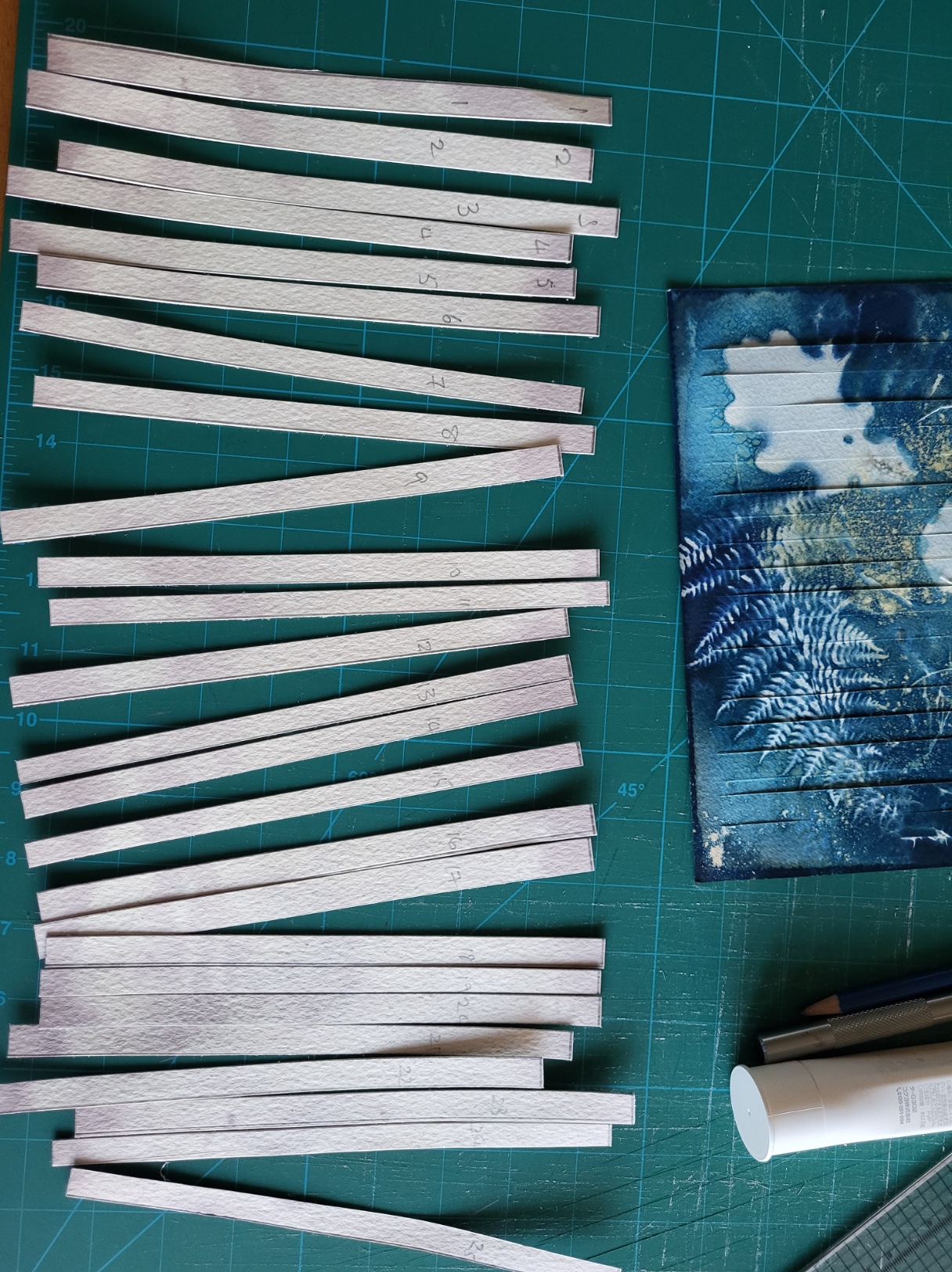
I numbered the horizontal strips so that they were added in the correct order, having taken a photograph of the intact sheet first which proved to be useful as I needed to refer to it on several occasions. This method worked ok until I got near the bottom of the piece when it became difficult to weave the horizontal strips in. Both cyanotypes were made on fairly heavy watercolour paper and it needed to be softer and more pliable for weaving. In the end I had to open up the bottom of the vertical strips to complete the work. Even pulling each stip up as tightly as I could, I was left with 4 horizontal strips which wouldn’t fit in, again, partly I think due to the weight of the paper. I think next time I will leave the top of both sheets intact so that I have a solid top and left side to work from, also print the cyanotype onto thinner paper.
Thinking about tomorrow, I have 2 cyanotypes, both featuring ferns, printed onto fabric. maybe I’ll see what I can do with them.
Phew, first one under my belt. Very experimental and still slightly damp so I’m not sure what it will look like when completely dry tomorrow and far less when it will be woven with another cyanotype later in the day.
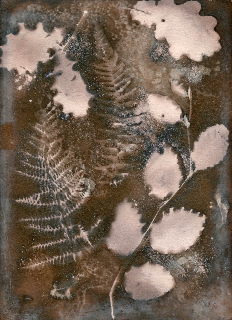
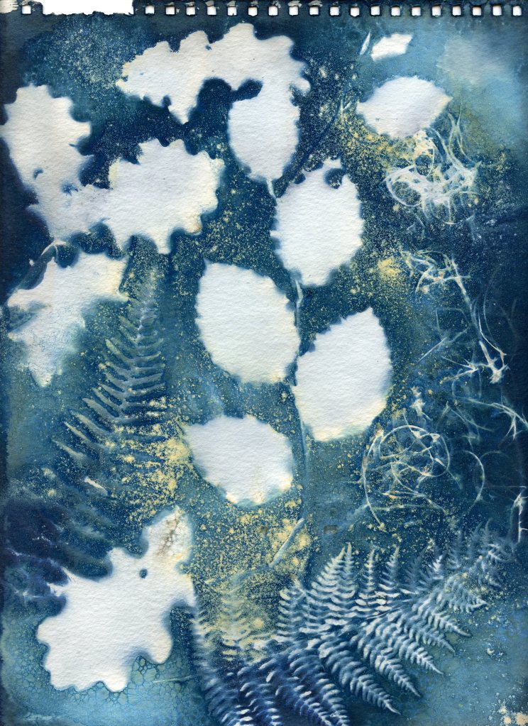
So my first challenge was to bleach and tone a cyanotype print, the intention being that I will weave it with another untoned image tomorrow. with hindsight I should maybe have copied this image before toning so that I could weave a toned and untoned version of the same image but I didn’t do that.
They are the same subject matter and the same size so we’ll see how it works!
The bleaching and toning process was very experimental, there are so many variables you never really know how it will turn out, a bit like making wet cyanotype prints. I used plain chlorine bleach which is quite harsh and can break down the fibres so needs to be used sparingly. After an hour there was no change in the colour of the print so I added a little more and finally after 4 and a half hours I was happy with the result. There was still quite a lot of blue in the image which would result in a darker shade once toned but I was happy with that.
I used green tea to tone the image, 10 teabags left to stew in 250 mls boiling water for 10 minutes and then another litre of cool water added. Research tells me not to use earl grey tea as it contains quite a lot of oil which prevents the paper from absorbing the colour. The tea I used was flavoured with mint and I worried that this might cause a problem too but it doesn’t appear to have been an issue. The print was left face down in the brew for about 30 minutes before I was happy with the results. As can be seen, there is quite a pint tinge to the highlights but I’m happy with that for now. Tomorrow’s job, once the print is completely dry, is to slice each print and weave them together. Exciting stuff!
I seem to have been stuck for a long time, dabling in this and that but not going anywhere. Over the past 12 months I’ve been doing a bit of patchwork and quilting, a little ICM and some infrared photography but cant really settle to anything. It was at a quiliting workshop that the tutor mentioned that she was starting a 52 week stitching challenge with Anne Brooks. Each week thoughout the year, Anne gives a new prompt and releases a short video showing how she interprets in in stitching; this year the prompts will all be words. The idea is that you build up the work over a 12 month period. This is way out of my comfort zone as my preferred mode of working is to know, or at least have an idea what I will end up with. But, I have signed up to ‘Bobbin along’. The second kick was an email from Artquest reminding us of their annual challenge, 30 in 30, whereby we have to create and upload a new piece of work evrey day for 30 days starting 1st February, today. I signed up to that too though not really confident that I could do both but as both as small amounts of work, why not?
So, where will I find the time? Well, most mornings I have a second cup of tea after breakfast and sit with my iPad for an hour. What a wasted hour! Surely I can use that hour to better effect somewhere in the day.
How will I approach these challeges? Bobbin along is relatively easy, if uncomfortable. We have one work to respond to each week. The first was layers, the second loops, then rolls, then hummock and this week’s word is wrinkles. Anne shows us via a video how she interprets in and how her work is building and we all follow suit. Some weeks it might take an hour and some maybe just 15 minutes, its up to us. There is a forum and a Facebook page so you can see how others have approached it and you can take inspiration from that or do something completely different. Watch this space!
Artspace 30 in 30 is slightly more challenging. For one thing, you must upload a new piece of art each day and if you miss a day you are out. I’m not a great decision maker so where do I start? I’m not confident enough with the stitching malakry to opt for that as I will probably spend more time unpicking than anything else so it has to be photography related. I’m probably not going to be able to go out and take new photos every day but I do have an archive of images I’ve done nothing with including lots of infrared photographs I haven’t processed and a pile of cyanotypes that have sat in a corner of my study for months, some years and that’s where I’m going to start. Much of this will be experimental though, it may work or it may not but isn’t that what art is all about?
I mentioned in a post a few weeks ago that I was very pleased to have had 2 images selected for the RPS Annual Members Exhibition, which is currently on in Bristol. Myself and 2 guests were invited to the private view a week ago and although a little nervous, I traipsed along with my daughter and one of my granddaughters. Nervous because although I exhibited work along with peers on a degree course we all took part in a few years ago but I have never exhibited work on a national stage before and I wasn’t sure how my images would stand up against all the other, much more accomplished photographers there.
Well I needn’t have worried, my 2 cyanotypes certainly held their own. There was only one other cyanotype on display and I would say that mine was far superior, not that I am biased at all! I really liked the way they were curated. printed at A3 with white borders in simple black frames and alongside other works of complementary colours.
I am glad of one thing and that is that I had submitted my work for this exhibition before the camera club competition mentioned in my previous post. If it had been the other way around and I had listened to the ramblings of the camera club judge, I would never have submitted them.
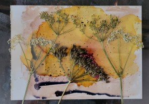
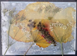
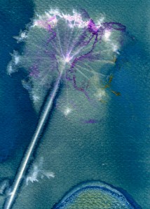
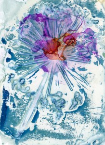
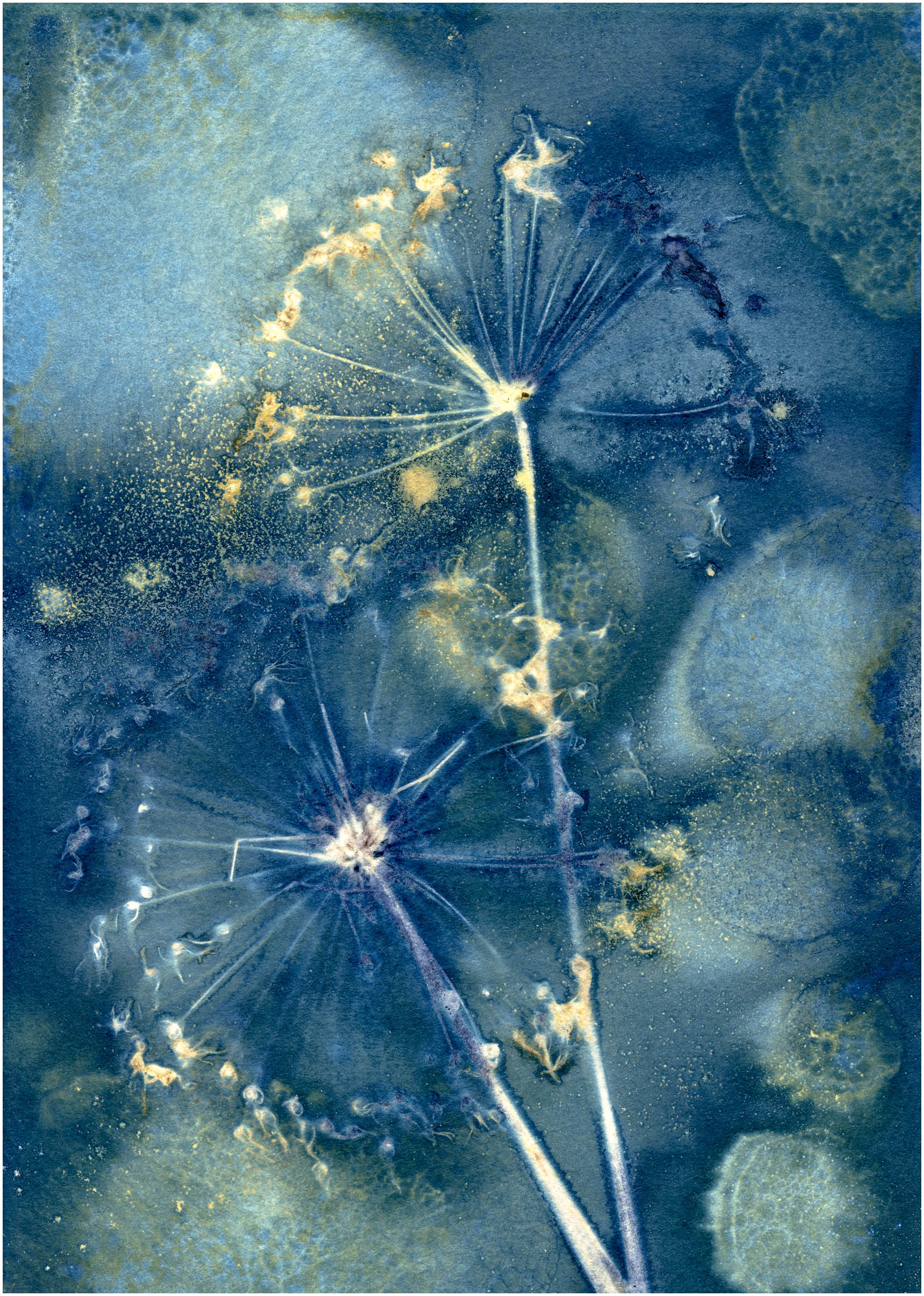
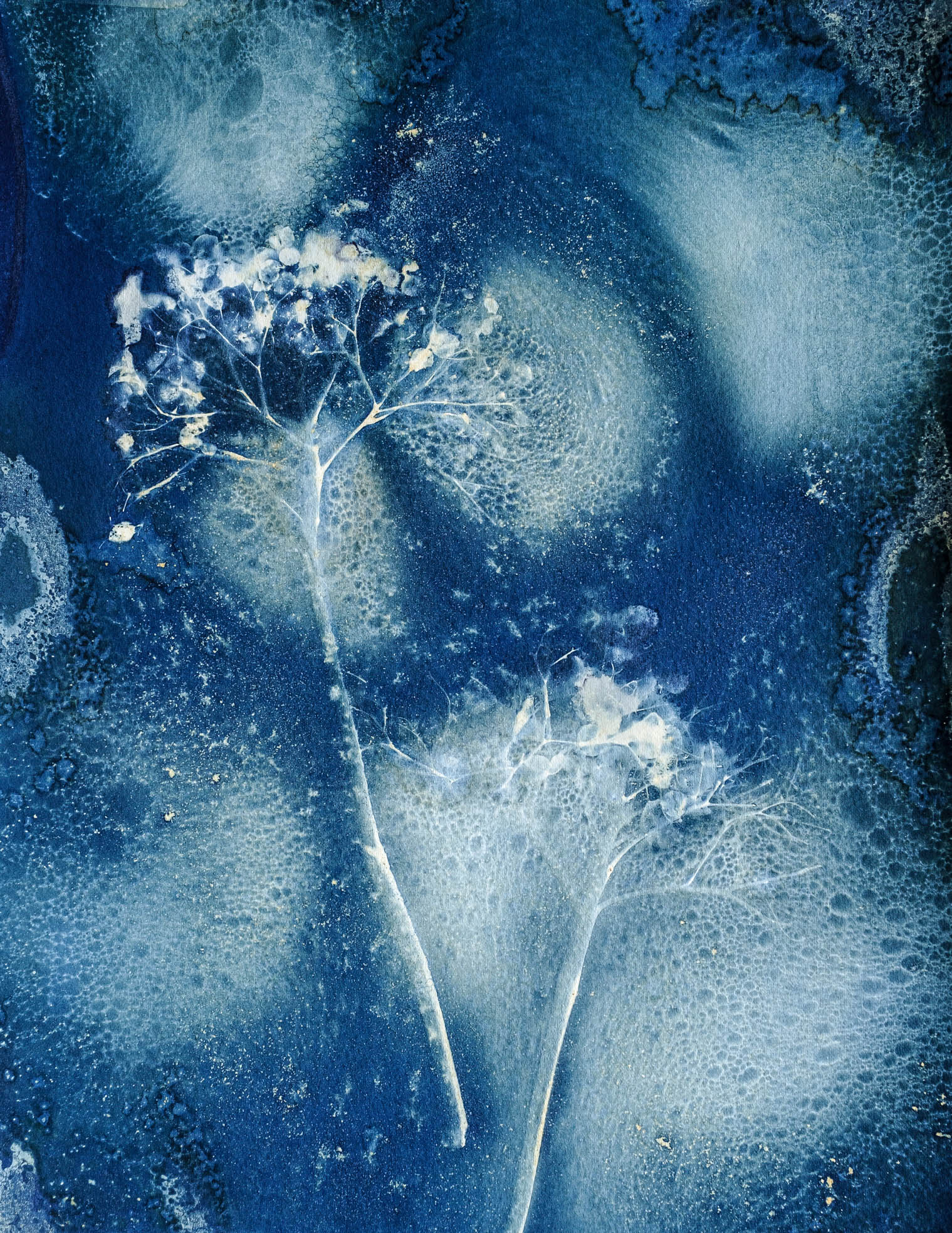
Hydrangea Seedhead and Allium seedhead wet cyanotypes with added vinegar, turmeric and soap bubbles on display at the RPS Summer Exhibition in Bristol from 1st July to 28th August 2023.
Yet another experiment resulted in a disappointing outcome, although there was a hint of possibility in my last but one experiment because I seem to have a better consistency of cyanotype chemicals and gelatine. There is still a problem coating the paper, partly I think because the cyanotype emulsion is diluted too far with the gelatine so is too weak but also, its still does not adhere well to the shiny surface. As a result I doubled up the exposure time and still felt it could have done with longer.
But, after following my bullet points from the last post, leaving the print overnight before washing, soaking for 5 minutes in iced water, then washing, I have a print with some evidence of cyanotype as well as ink.
It is a pretty rubbish image but the purpose was to experiment getting the emulsion to stick to the shiny paper without using more resources rather than creating a work of art, so I will persevere and see what materialises.
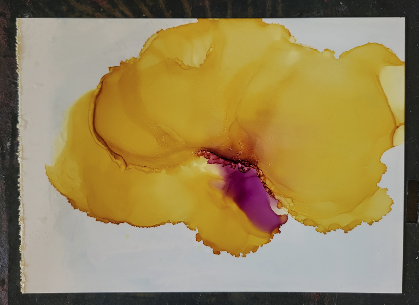
I have however had a little bit of a breakthrough in that someone on the Facebook Cyanotype page posted some images she created using cyanotype and alcohol ink. Her process is different but I think very successful.
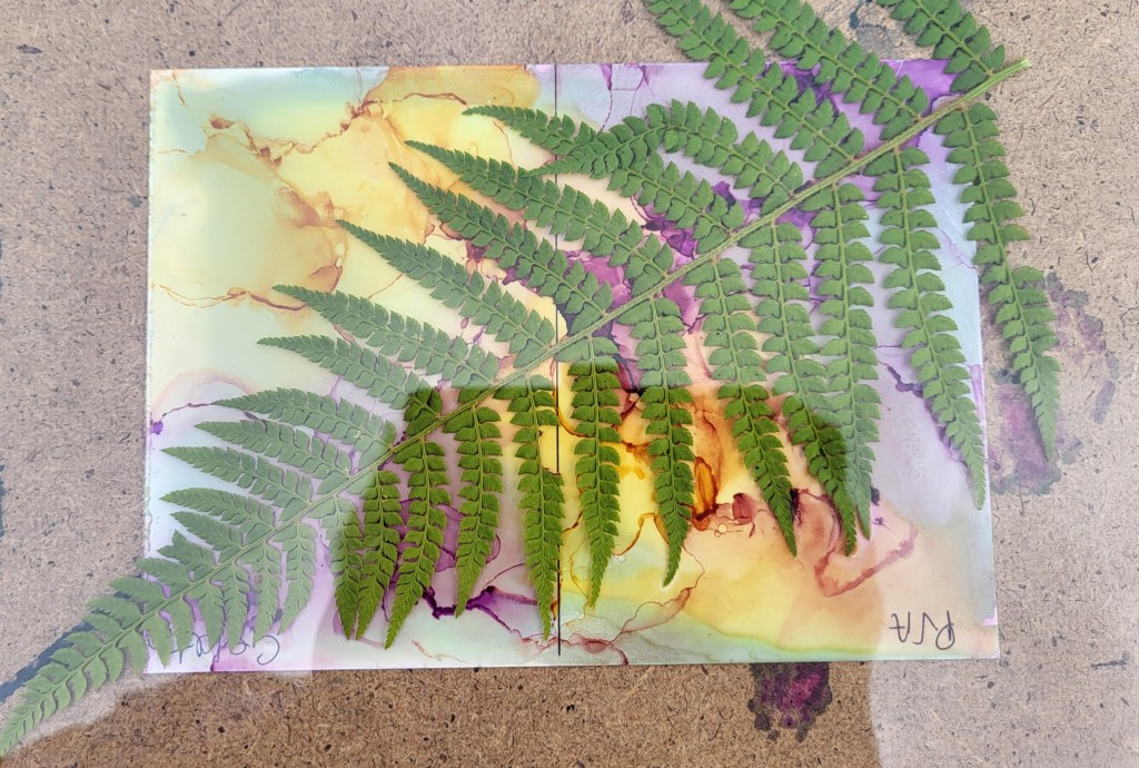
Cyanotype tinted with alcohol ink by Leigh Wallace
Leigh mixes her own chemicals, exposes, adds vinegar to the rinse then hand tints with alcohol ink diluted with a little water. The gold border is also added this way. I think this is stunning and would certainly hang it on my wall!
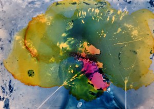
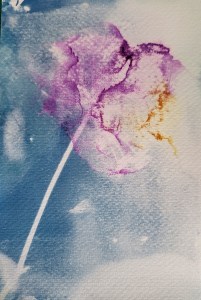
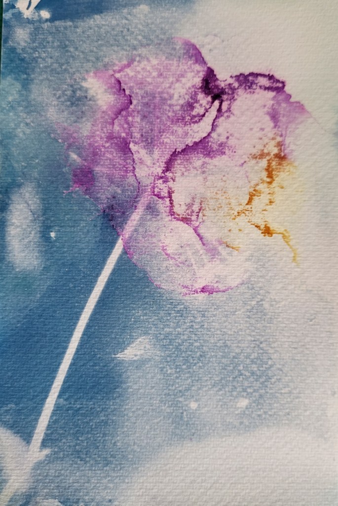
As I am still very much in the experimental stage and as previously mentioned, keen not to use too many expensive resources in the process, I have gone back to an existing print to try this out. My first question was why dilute in water rather than more alcohol, so I have tried both. This is a cyanolumen from a couple of weeks ago on the left and the tinted version on the right.
In the tinted version, the pink, or ‘plum purple’ as it says on the bottle, is diluted in water, whereas the yellow is diluted in isopropyl alcohol. I actually found the ink diluted with alcohol easier to work with. It dries more quickly and it seems to have a more translucent quality. I also painted some of the yellow on the blobs and quite liked the effect that gave. There are so many variables though and each impacts differently on the outcome.
For example, this print was made on expired dark room paper, Kentmare Bromide Stipple, and that may have an impact, so next experiment with be on the watercolour paper I usually use for cyanotypes. For the first time in a couple of weeks though, I am starting to see a glimmer of light at the end of the tunnel.
Over the last week or so I have continued to experiment with alcohol ink and cyanotype mixed with gelatine. I’ve not yet learned what I can do but I have learned quite a lot about what doesn’t work!
I found another of Jo Howell’s blogs in which she talks about working with cyanotype on glass and thought this principle might work on the Yupo paper I have been using. In this blog, Jo discusses how she dilutes the gelatine and how much cyanotype chemical she adds, so that was my starting point. Jo said she followed the guidance for dissolving the gelatine but used less water than the suggested pint, so that it fitted into her lightproof bottle – not sure how big that was though! I diluted my gelatine up to about 1/2 pint, added the cyanotype chemicals, 25 ml of each, then the solution was allowed to cool overnight by which time it had turned into a fairly loose jelly.
My first mistake was to use this to coat the paper but when I re-read Jo’s blog, she warmed the solution up slightly so that it was in liquid form.
As you can see, the paper isn’t very well covered and once exposed, you can clearly see areas not coated at all.
I did have hope of another happy accident but that was not to be because when I washed the paper, all of the cyanotype washed off, leaving the paper as it was before any cyanotype had been applied. When I went back to Jo’s blog again, she talked about soaking the exposed paper in very cold water to set the cyanotype before washing whereas I had just ran it under the tap.
So, the next stage will be:
Warm cyanotype/gelatine mix before coating
Make sure paper is super clean – Jo makes the point that if it isn’t the solution will pool around the dust.
Expose – not sure for how long. the last print was exposed for 10 minutes so I will try 20 next time.
Maybe leave overnight to harden? I will try one with and one without
Soak in ice cold water for 5 minutes to set gelatine
Following on from my last post, I decided to take my experiments with cyanotype and alcohol ink a little further because in neither case I had got exactly what I was looking for.
In the second print in my last post, which was on watercolour paper, whilst I quite liked the painterly effect, the whole thing was under exposed, either that or the PVA size, which I had added to allow me to manipulate the ink, had stopped the cyanotype chemicals from being absorbed into the paper. Either way, I needed to work out what was happening. So, I coated the paper and exposed it again, carefully placing the same seedhead onto the wet paper.
I didn’t add any of the additional extras that I would normally add to wet cyanotypes, such as vinegar, turmeric or soap suds, one thing at a time!
The resulting print is certainly more like a cyanotype than the previous attempt. I do need to think more carefully about what effect I want from the ink, so more practice needed there. I also need to take my time and do some test prints to get the exposure right. This one, being wet , was exposed for several hours, then left overnight before I removed the plant material and washed the print. In the end, it was washed for quite a long time to get as much chemical out as possible as the print was quite dark.
I mentioned in my last post that Yupo paper is quite expensive. Too expensive to experiment with really, but there doesn’t seem to be a right or wrong side and as the chemicals don’t soak into the paper, I decided to try my second experiment with this, on the reverse of the first print.
First time round, I felt that the consistency of the gelatine was too thick, so after a few more YouTube searches, I diluted it further. I’m still not sure I have the ratio of gelatine to cyanotype chemicals correct, if anything, I may have diluted the gelatine too far this time, as the solution did not adhere to the paper was well as I’d hoped. Again, this was exposed whilst the paper was still wet and again, whilst not what I had expected, it does have potential and I do quite like the painterly effect.
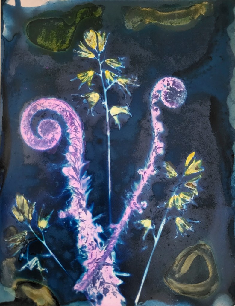
My final print from this session was a wet cyanolumen on expired Kentmere Bromide Stipple darkroom paper. Again I added a little of the gelatine mix to the coating solution as last time I used this paper, I found that the cyanotype chemicals did not adhere to the paper very well. The only problem I had this time was that the plant material stuck to the paper so I had to soak it the whole thing in order to remove it. The plant material here is bluebells and ferns pressed last year and then forgotten about. This print was fixed in Ilford Rapid Fixer. Do I need to do that with a cyanolumen? I know I need to fix lumen prints but not sure if I need to fix cyanolumens too, need to check that one out!
I was inspired by an artist on our local ‘Open Studio’ circuit last year who creates wonderful work using acrylic paint and alcohol ink and as there are plenty of tutorials on YouTube, thought I’d have a go.
You just need a couple of inks to start with, some smooth non-porous paper, some 95% isopropyl alcohol, a straw or hair dryer and off you go. Drop some alcohol onto the paper add some ink on top and push it around with the straw or hairdryer. I used the little puffer I have for cleaning dust off my lenses.
One of the reasons I wanted to try this process out though was because I had also seen someone on Instagram, I can’t remember who now, put cyanotype on top of alcohol ink with some interesting effects. It sounds simple enough, but the type of paper needed for cyanotype is absorbent and for alcohol ink, non-absorbent so how to get round that? I couldn’t find anything on YouTube about making cyanotype on yupo paper or layered with alcohol ink but there are several tutorials showing how to make cyanotypes on glass using gelatine mixed with the cyanotype chemicals. I had also done some experiments with gum bichromate where I needed to size the watercolour paper before use with PVA size so that the gum adhered to the paper so that was another options. In the event I tried both so save time, covering one half of the paper with a cyanotype/pva size mix and the other with cyanotype/gelatine mix, let it dry and went through the normal process for exposing cyanotype.
The PVA/cyanotype mix didn’t work at all as the mix just ran straight off the paper. I had more, albeit limited, success with the gelatine mix in so far as I got an image but still lots of lessons to be learnt.
Although I had followed the guidance on one of the tutorials about the proportions of cyanotype to gelatine, the gelatine was not diluted enough and the mix was too thick. As can be seen from the image above, I used this as a test print for exposure and did get an image but the ink design dominates and drowns out the fern, so the main learning point from this is that I need to which is the more important, cyanotype or ink and it is definitely cyanotype.
My second attempt faired better, though there are lessons to be learnt there too.
One of the methods of sizing watercolour paper for gum bichromate is to use a well diluted gelatine mix and I had some already prepared for the next gum bichromate session. This was enough for me to add a little ink where I wanted it to be, let it dry and coat with cyanotype chemicals. This time I used a dried head of cow parsley and exposed under a UV lamp, no test strip this time. What I had hoped was that the ink would appear in the white areas blocking the lamp and the rest would take on the normal cobalt blue of the cyanotype but it didn’t.
The size has prevented the paper absorbing the cyanotype chemicals, the print is under-exposed so I’m not getting the outline of the seedhead coming through, have I over washed the print? Maybe.
I do quite like the painterly effect though so all is not lost so where to next? The ink has got to be the accent rather than dominate, so maybe I just size a small area where I will apply the ink. I will try again with gelatine but in a more diluted form and I will definitely use watercolour paper which is much cheaper than Yupo.
Having been a member of the RPS for some years, I always get the annual email through inviting me to submit for the annual members’ exhibition and each year I ignore it. No reason other than I never think I have anything worth submitting and never really get round to doing anything about it. Over the last few years however I have really enjoyed experimenting with cyanotypes, particularly the wet process as you never quite know what you’re going to get and this time, when the email came in, I thought, why not? I submitted 5 cyanotype images, all of which camera club judges had been scathing about, but the RPS really does seem to be embracing alternative processes. I mentioned in an earlier post the exhibition I visited back in November and I also know that last year, a panel of cyanotypes was awarded an ARPS distinction, so I uploaded the images and then forgot about it.
Then, surprise, surprise, in April, I had an email advising me the that some of my images had been selected for the exhibition. I wasn’t told at this point which ones. I was asked not to announce my success on social media yet, and then nothing for another month or so. Then, towards the end of May, I had confirmation about which images had been selected along with a request for high resolution images and more information and here they are.
To say I was delighted is an understatement. 3500 entries and I have two of the 80 selected.
The RPS Summer Exhibition opens on 1st July and runs to 31st August 2023 at:
RPS House 337-340 Paintworks Arnos Vale Bristol BS4 3AR